Food blogging is a crowded space, and first impressions count. A great recipe won’t get the attention it deserves if the blog is cluttered, hard to read, or tricky to navigate. High bounce rates (often over 50%) prove that readers won’t stick around if the design isn’t working for them.
A well-designed blog does more than look nice. It keeps visitors engaged, encourages recipe saves, and builds trust so they come back for more. Small tweaks, like better typography, mobile-friendly layouts, and smart SEO choices, make a huge difference.
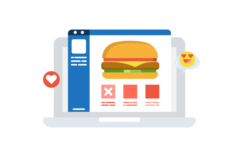
Designing a food blog that’s both beautiful and functional doesn’t have to be complicated. These seven trends will help create a site that’s easy to use and fun to explore. WP Recipe Maker makes it even easier, offering complete control over recipe layouts so every post is as engaging as the food itself.
The #1 Recipe Plugin for WordPress
Create recipe cards that are on-brand, SEO-friendly, feature-packed and monetizable.
1. Choose modern typography and themes that fit your branding
Typography and theme choices directly impact engagement and recipe success rates. Readers need to scan ingredient lists quickly, follow instructions easily, and stay focused on the content without getting lost in cluttered or hard-to-read text. Some typography strategies for a better reader experience include:
Scannable ingredient lists: Clear measurements and bold section headers make recipes easier to follow.
Visual separation: Ingredients, steps, and notes should have distinct formatting to avoid confusion.
Highlight details: Cooking temperatures, timing, and crucial instructions stand out when bolded or sized up slightly.
Small tweaks in font choices and layout make recipes more readable and enjoyable to follow, which keeps visitors coming back.
But it’s not all about typography. Choosing the right WordPress theme also plays a huge role. It sets the foundation for a blog’s look and feel, but it shouldn’t be relied on for recipe layout functionality. Many themes offer built-in recipe styling, but these are often rigid and can lead to performance issues. Instead, choose a theme that offers aesthetics, not custom functionality, and pair it with a dedicated recipe plugin like WP Recipe Maker, allowing fully customizable, high-performing recipe layouts. There are plenty of free themes that offer a great starting point!
💡 Pro tip: A/B test font styles, sizes, and spacing to see what keeps readers engaged the longest. Even small adjustments can have a big impact on readability and user experience.
2. Design for mobile users to keep them on your site longer
Most readers aren’t sitting at a desk while following recipes – they’re in the kitchen, phone in hand, swiping through steps with messy fingers. A mobile-friendly design makes the difference between a recipe that’s easy to follow and one that sends users bouncing back to Google in frustration.
Where the recipe card sits on the page matters. Some readers want to scroll through the full post, while others just need the details. A “Jump to Recipe” button helps both types find what they’re looking for fast. WP Recipe Maker makes this easy by letting bloggers add a clear, one-tap shortcut at the top of each post.
You also need to think about formatting for those smaller screens. Think about:
Ingredient lists and instructions should be spaced for readability, avoiding dense blocks of text.
Process photos should be large enough to be helpful but not so big that they slow down load times.
Step-by-step layouts should keep scrolling minimal – stacking multiple instructions in one step can overwhelm readers.
Videos should be embedded in a way that doesn’t disrupt the reading flow.
Readers are more likely to print or save recipes from their phones, so the social sharing buttons should be within a thumb’s reach – not buried at the bottom of a post. The mobile buttons should also be optimized, encouraging users to quickly send recipes to Pinterest, Instagram, or messaging apps.
💡 Pro tip: Check how a recipe looks on different devices. If a blog post is clunky to navigate on a phone, readers will not stick around, no matter how good the recipe is.
3. Create a user experience that keeps readers coming back
A great food blog should be an experience. The best-designed blogs make it easy to browse, discover new dishes, and enjoy the process of cooking. When readers can quickly find what they need and explore beyond a single recipe, they’re more likely to return.
Readers often come looking for a specific type of meal – quick dinners, seasonal treats, or dietary-specific recipes. An intuitive navigation setup helps them get there faster:
Organized categories: Make filtering by meal type, cooking time, or dietary preference easy.
Recipe search bars: A must-have for users who know exactly what they’re craving.
Related recipes: Show dishes that pair well together or variations of the same recipe to encourage deeper browsing.
Features that remove friction from the cooking process keep readers engaged:
Recipe scaling and unit conversions: WP Recipe Maker’s built-in conversion options make it easy for readers to adjust servings and measurement units.
Cook Mode: A distraction-free setting that keeps the screen from falling asleep while someone follows a recipe step by step.
Not only do we want to keep readers engaged, but we also want to keep them on your site for as long as possible. To do this, try using:
Expandable process photo galleries allow readers to click for more details without overwhelming the page.
Sticky navigation bars, so when users scroll back up, a quick-access menu should follow them, helping them jump between sections without losing their place.
4. Use white space and hierarchy to guide your readers
A cluttered blog is overwhelming, and too much visual noise makes it harder for readers to focus on your recipes. White space (also known as negative space) is one of the simplest but most effective design tools for improving readability and keeping visitors engaged.
Enhances focus: Draws attention to key elements like recipes and photos.
Improves readability: Consistent spacing between headings, paragraphs, and images creates balance.
Boosts time on page: A clean, easy-to-navigate layout keeps visitors engaged longer.
A strong visual hierarchy also helps guide readers naturally through a post:
Use larger fonts and contrast: Headings should stand out clearly from the body text.
Strategically position images: Place photos near the relevant text to reinforce information.
Highlight important elements: Calls to action, like “Save Recipe” or “Print,” should be visually distinct.
There are, however, some common design mistakes to avoid from the get-go:
🚫 Overcrowding: Too much text or too many images close together makes a page feel chaotic. 🚫 Inconsistent spacing: Uneven padding between sections disrupts visual flow. 🚫 Competing focal points: When everything tries to stand out, nothing does.
White space isn’t wasted space – it’s an excellent tool for improving user experience. A blog that’s easy to scan, read, and navigate keeps visitors around longer and makes recipes more memorable!
5. Place food photos where they drive the most engagement
Great food photography encourages them to save, share, and actually cook the recipes you’ve created. The right image placement can make all the difference in how a recipe is perceived and interacted with.
The first image a reader sees should be above the fold – meaning they don’t have to scroll to find it. This is known as the hero image. A well-lit, high-quality hero image sets the tone and makes a strong first impression. Readers are more likely to stay and explore if a dish looks appetizing.
Effective food photography is all about the process and presentation, and you can do this by building trust:
Process shots help guide readers through each step, making them feel more confident about cooking the recipe.
Final presentation photos show the finished dish in its best light, helping readers visualize the result and get excited to try it themselves.
Along with placement, you also need to think about sizing and spacing to maintain an efficient flow:
Large, high-resolution images should be optimized to prevent slow load times.
Consistent spacing around images ensures they enhance the layout instead of making it feel cluttered.
Recipe card placement should allow images to complement instructions without overwhelming the text.
Lastly, vertical, high-quality images perform best on Pinterest and social media, increasing the chances of shares and driving more traffic to the blog. Adding Pinterest-optimized images and a “Pin It” button makes sharing easy!
6. Design with monetization in mind
Sure, a food blog is a space to share recipes, but it can also be a serious revenue stream when designed well. How content is structured influences how long visitors stay and what they click on. Small tweaks in layout and positioning can lead to significant boosts in revenue.
Heat maps help food bloggers position monetization elements where they get the most engagement. Many successful blogs use heat map analysis to determine the best spots for recipe cards and affiliate links. Revenue can improve by:
Placing recipe cards near the top for better visibility.
Strategically positioning affiliate links for ingredients and kitchen tools where readers naturally look – often within the ingredient list.
Balancing ad placement so ads enhance, rather than interrupt, the experience.
Recipe organization also impacts page views and ad revenue. A well-structured blog keeps visitors browsing longer, translating into more ad impressions:
Grouping recipes by meal type, season, or dietary preference makes navigation effortless.
Featuring related recipes within posts or at the end of a page encourages readers to explore more.
Optimizing category pages with visuals and internal links drives deeper engagement.
Beyond category structure, a food blog should act as a content funnel, guiding visitors toward valuable actions:
Email sign-ups and lead magnets (like free meal plans) help build a loyal audience.
Strategically placed CTAs for affiliate products convert readers into buyers.
Exclusive content or membership models offer an additional revenue stream.
WP Recipe Maker helps turn recipes into revenue with built-in monetization features like:
Affiliate links that integrate directly into ingredient lists and equipment recommendations.
Shoppable recipe features that connect with services like Instacart or Amazon for effortless commissions.
Placing in-content ads in natural breaks keeps them organic rather than intrusive.
Sticky ad placements ensure visibility without disrupting readability.
Easy-to-tap affiliate links make shopping seamless for mobile users.
Remember, the secret ingredient is balance. Too many ads or aggressive placements push readers away, but smart, user-friendly monetization keeps them engaged and increases conversions.
7. Incorporate SEO design elements that boost your rankings
A well-designed food blog needs to be structured for search engines to drive traffic. Google prioritizes usability, content clarity, and structured data, so integrating the right SEO design elements improves rankings and visibility.
Structured data (JSON-LD) is essential for getting recipes featured as rich snippets in search results. It helps Google understand cooking time, ingredients, and ratings, increasing the chances of appearing in enhanced search features.
“Blogs using structured data properly see higher visibility and click-through rates. WP Recipe Maker simplifies this by automatically generating JSON-LD metadata to meet Google’s rich results requirements.”
Alt text for images improves accessibility and search rankings. Since search engines can’t “see” images, keyword-rich alt text helps them understand the content. This makes images more likely to appear in Google Image Search, driving additional traffic.
Page speed optimization is crucial for rankings. Compressing images, enabling lazy loading, and using lightweight design elements prevent slow load times. WP Recipe Maker is built for performance, ensuring recipe pages stay fast without sacrificing features.
Semantic HTML improves search engine readability. Tags like <article>, <section>, and <header>organize content logically, leading to better indexing and rankings.
Mobile-first indexing means Google prioritizes a site’s mobile version when determining rankings. Recipe layouts must be mobile-friendly, not just for user experience but also for SEO. WP Recipe Maker ensures mobile-optimized recipe cards, helping food blogs rank higher.
While many focus only on keywords, SEO is also about structure, speed, and usability. Thoughtful design choices help recipes rank higher and attract consistent organic traffic.
Create stunning recipe pages with WP Recipe Maker
Design plays a huge role in making a food blog stand out, but having the right tools makes all the difference. WP Recipe Maker is built to help food bloggers create visually appealing, user-friendly, and SEO-optimized recipe pages without hassle.
SEO is baked right in. WP Recipe Maker automatically generates JSON-LD structured data, ensuring recipes meet Google’s rich snippet requirements. That means higher visibility in search results and better chances of attracting organic traffic.
Customization is easy, too. With the Template Editor, bloggers can fully customize recipe cards to match their brand – that’s right, no coding! WP Recipe Maker also works with popular page builders like Elementor, making it simple to create professional, well-structured recipe pages that look great on any device.
Are you a food blogger looking to create stand-out content, grow your readership, and monetize your platform? Subscribe now and get monthly Recipes for Success!
Learn how to start your own weight loss blog with this step-by-step guide. Prepare for success, promote your blog, and discover valuable weight loss blogging tips!
Creating tasty recipes for YouTube takes serious effort. You spend hours planning, shopping, cooking, and filming – but what if nobody finds your videos? That’s where smart keyword research comes in. Cooking channel keywords are simply the search terms viewers type into YouTube – from broad ideas like “cooking” or “recipes” to super specific phrases…
Imagine this: You’ve just created a mouthwatering recipe for a delicate chocolate soufflé, and you’re eager to share it with the world. But as you sit down to document your culinary masterpiece, you find yourself at a crossroads. Should you write out the recipe on your blog, or should you film yourself whipping up the…
Recipe testing is a professional process that ensures recipes are reliable, accessible, and ready for publication. Major food publications, cookbook authors, and test kitchens rely on recipe testers to refine instructions, verify ingredient accuracy, and troubleshoot any issues before a recipe reaches the public. Testers don’t just follow recipes; they analyze them, provide constructive feedback,…
91% of U.S. consumers turn to online recipes for meal inspiration, according to Chicory’s Annual Digital Recipe Usage Survey. Yet there’s often a disconnect between finding a delicious recipe and getting the ingredients to make it. Thankfully, there is a feature that can help with that: Shoppable recipes. Shoppable recipes are digital recipe pages that…
Starting a food blog is a great way to share your passion for cooking and baking. From professional chefs to home cooks, a well-designed WordPress website helps you reach a larger audience and showcase your recipes beautifully. WordPress food blog themes come in both free and premium versions. Free themes provide essential features while premium…