Responsive Layouts
You have different layout options when creating a grid. Either specify an exact width for each grid item or set the number of columns you want to have for your grid.
Different layout options can be set for desktop, tablet and mobile with the exact breakpoints you need as defined on the settings page.
Demo – Fixed Width
This grid is set to have items of 150 pixels wide on desktop but switch to 100 pixels wide on tablet. For mobile we’ve set it to switch to 2 columns instead of fixed width.

A Lovely Bridge
May 5, 2015

A Red Rose
May 5, 2015

Are you a Dog Person?
May 5, 2015

Birthday Chair
May 5, 2015

Cat in the Woods
May 5, 2015

Holiday on the Beach
May 5, 2015

Lady Liberty
May 5, 2015

Lazy Sunday Breakfast
May 5, 2015
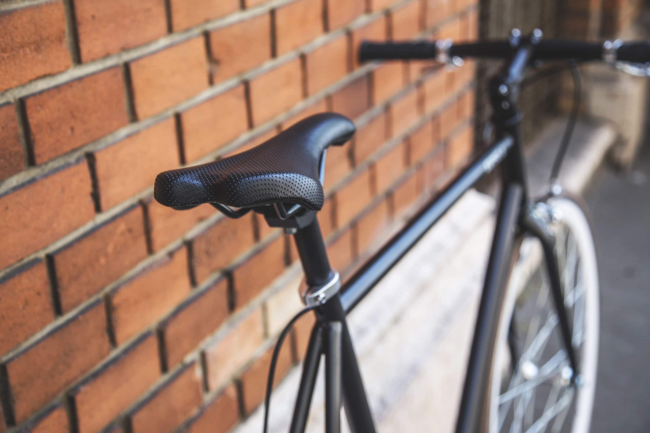
My brand new Bike
May 5, 2015

My Desk
May 5, 2015

New York City
May 5, 2015

Summer Festivals
May 5, 2015
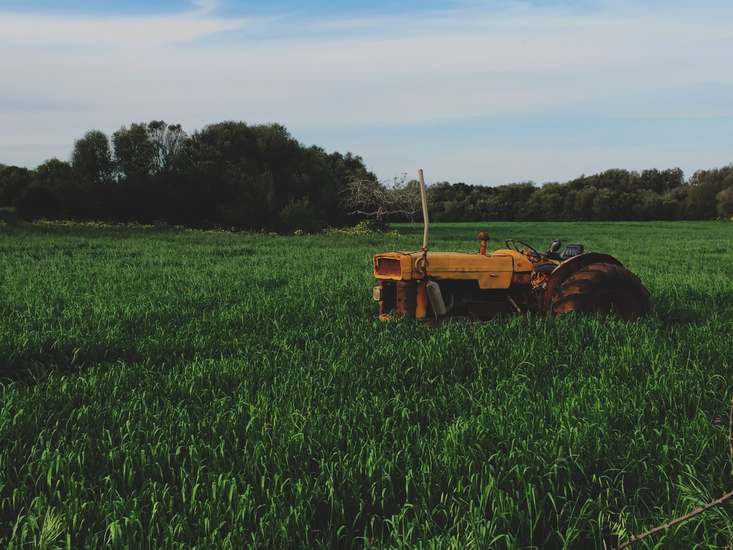
Working in the Fields
May 5, 2015
Demo – Number of Columns
This grid is set to have 4 columns on desktop, 3 on tablet and 1 column on mobile.
Summer Festivals
May 5, 2015
Lady Liberty
May 5, 2015
Holiday on the Beach
May 5, 2015
Working in the Fields
May 5, 2015
Are you a Dog Person?
May 5, 2015
My brand new Bike
May 5, 2015
A Lovely Bridge
May 5, 2015
New York City
May 5, 2015
Lazy Sunday Breakfast
May 5, 2015
My Desk
May 5, 2015
Birthday Chair
May 5, 2015
Cat in the Woods
May 5, 2015
A Red Rose
May 5, 2015